There was a lot to take in again in my Cinema 4D tutorial. This is my second tutorial and today I was taught much more interesting processes to create unique Cinema 4D artwork. Cinema 4D is a programme that can randomly generate outcomes, using different processes to do so. Below, I will talk about the processes I applied to create the C4D artwork, using my notes to explain and for me to use as future preference.
BRIDGET RILEY
First of all, I was shown the work of Bridget Riley to clarify what can be achieved using Cinema 4D to create unique artwork. I also found some artwork in my own time to use as a reference to building my own designs. Yomagick and Miquel Rodrigues Estany.
MIQUEL RODRIGUES ESTANY
http://cgterminal.com/2015/06/10/cinema-4d-tip-displacer-blub/
QUICK TIP 05: DISPLACER BLUB from
Berd on
Vimeo.
YOMAGICK
https://www.behance.net/gallery/24702819/Nice-Posters-Vol-1
THE FIRST TUTORIAL / JAY PAYNE LESSON 2
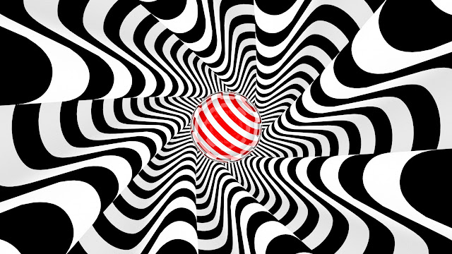
To begin the process, I clicked on the rectangle to create a shape path. Then I clicked and created an extrude object tool. Next, I dragged the rectangle into the extrude tool and increased the three dimensional movement to '5000cm'. This made the rectangle expand far into the background, filling the 3D space and creating a structure we can work with to create what we want to create. When satisfied with the rectangular extrude, I added a twist tool and dropped it into the extrude tool in the workspace, making sure the twist is dropped beneath the rectangle in the extrude drop box. I edited the twist mode to unlimited and the twist angle to 10 to create a twist effect that suits.
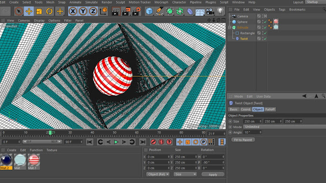
After, I changed the caps on the extrude to none, creating a hollow tube in the twisted shape. Now, I added a texture, making sure to have only luminance selected and I then created a checkerboard surface to the texture. I edited the checkerboard to create stripes by clicking on the colour box beneath the texture. In this box I alterd the 'u' frequency to '0' and the 'v' frequency to '40', this created a black and white stripe effect. To add the texture to my shape, I dragged the texture onto the extrude panel in the work area.
After this I added a sphere shape to the workspace. I altered the shpere radius to '40' and changed the 'z' coordinate to 500cm, the 'R.P' coordinates to '30' and 'R.B' coordinates to '40'. This pushed the sphere into the tubular pattern and gave the shape a slight tilt.
I added colour to the sphere by adding a similar texture to the shape. I 'cmd' and dragged the material to create a copy, clicked on the colour box to change the black stripes to red. With this material, I altered the 'u' frequency to 10, creating a different thickness to the stripes to contrast that of the background. I then added a reflectance to the material. I did this by going to the reflectance tab and added a reflectance legacy option. To enhance the refection effect, I clicked layer colour and selected fresnel. this created a more realistic reflection to the sphere and improved the whole composition of the design.
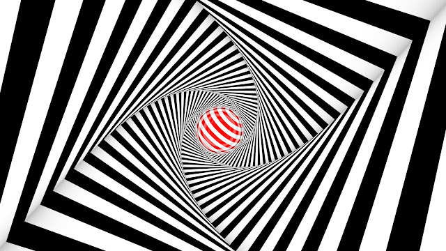

I saved the designs as jpegs, with the effect of ambient acclusion to enhance the depth of detail. I experimented with different shapes to create different tubular patterns. As you can see, I have applied the flower shape path and the star shape path in the images above, both look great and unique in their own way. My favourite is the star path, it possess a clean and slightly retro appeal to it.
Next, I learnt how to add random moving objects into the 3D space and how to add collision paths to make the objects flow through the tube and bounce off of the tube walls during the process.
Moving Sphere Emitter settings/ I clicked simulate to create an emitter. I then edited the emitter settings to make the push shapes across the surface of the floor. I did this by, typing the 'z' coordinates to '70', selected particle and changed the stop emmission to '200f', speed to '200cm' and finally the rotation to '360'. After, I then dragged the sphere into the emitter I have just created and programmed. I changed object properties of the sphere radius to '15', creating an angular spin when emitted.
Colidder settings/ On the extrude object tool in the workspace, I selected tags, simulation tags and clicked 'collider body'. With the setting 'collider mesh' selected. Then we also do the same for the sphere object. Seclect 'collider body', 'rigid body' and moving mesh. Now the balls will be programmed to bounce of the walls of the tube. To make the balls flow all the way through the tube, I edited the gravity of the 3D space. I clicked, project, mode, dynamics, gravity and changed the gravity to '0'.
Cinema 4D / collider / sphere / extrude / pattern from
Charlie Hamnett on
Vimeo.
C4D ARTWORK / RANDOM GENERATION
Next, I was taught how to create cinema 4D artwork using shapes and the emitter tool. This technique creates interesting and unique designs that are randomly constructed during the process.
First of all, I created opened up a new C4D document and created a new plane. I edited the value of this new plane to, width '1000cm', height '1000cm', width segments '50cm' and height segments to '50cm'. For this document, it was advised I selected display 'gouraud shading lines', this provided me with a better insight to the movement my shapes will make and show me in greater detail the areas that need lift, or other movement edits.
Next, I added a displacer object and edited its settings to, height '50' and its shading. To edit the shading I clicked, shading, shader and then noise. After this, I added colour to the work space. The colour settings I used was, only luminance, Texture, surfaces, checkerboard and changing the 'u' frequency of the checkerboard to '0' and the 'v' frequency to '20'.
Then, I added a smooth object subdivision surface. I dragged the plane panel and displacer panel into the subdivision surface, ensuring the that the plane panel is above the displacer and the displacer resides within the plane panel. I then dragged my material onto the plane tool and created a gradient texture in the process. The gradient texture allows me to add different colours to be emitted in the simulation.
Finally, I created a graphic that I could either save as a JPEG or video. I could create lots of quick and interesting artwork using this C4D technique. All I needed to do was alter the projection of the colour and play around with some of the editing techniques with the colour object. I will explore this idea further and create some interesting posters to frame and present.
POST MODERNIST ARTWORK
Here is the final tutorial of the lesson. I was taught how to create a post modern design using the emitter tool and shapes. Plus the edition of text to make it our own.
First of all, I created eight different colours that would represent a post modern scheme to the design. Then I created eight polygons. the first two polygons I created was, one wit the height of '200cm' width with '4cm' height and the other with '4cm' in width and '200cm' in height. The rest (six) of the polygons was '70cm's' by '70cm's'. I then dragged one of each colour to one of each polygon.
Next, I added a particle emitter. I edited the particle emitter coordination units to make sure the tool emits the objects upwards away from the surface of the floor. I did this by changing the R.P coordinates to '90'. I then dragged all of the polygons into the emitter, programming the emitter to fire these polygons up into the 3D space.
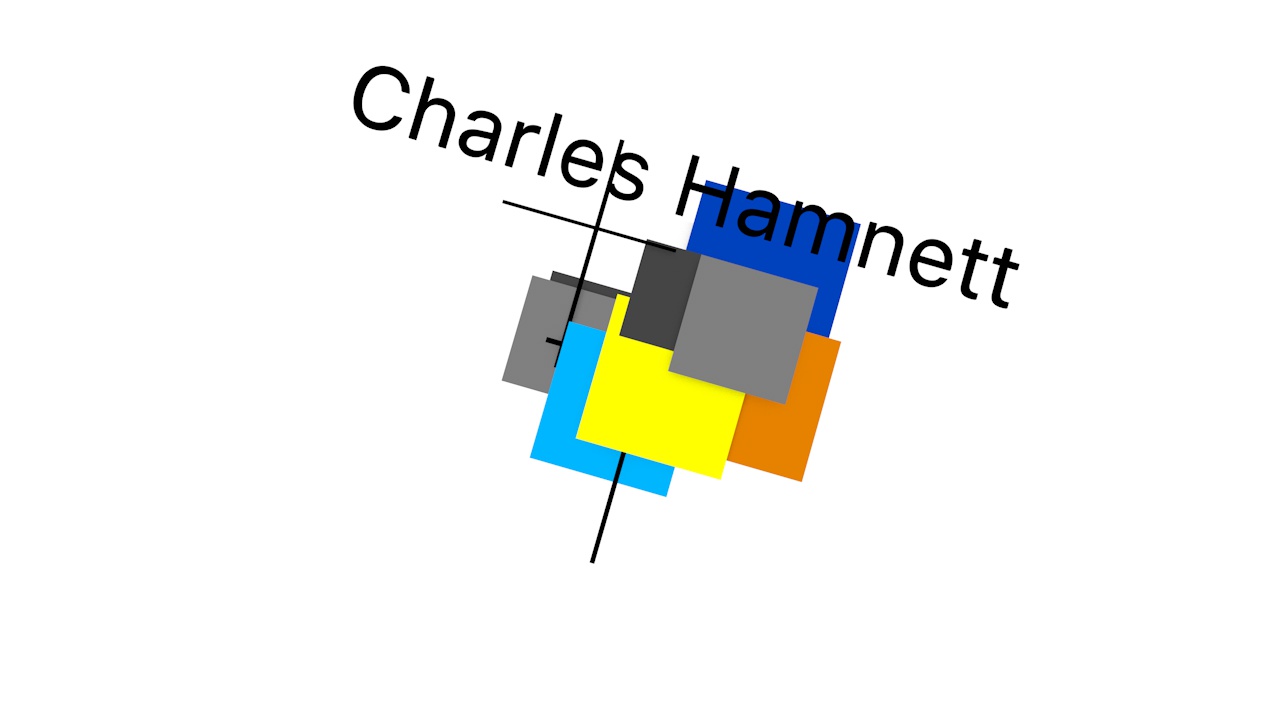
I then added a camera to accuratly position the point of view above the emitted shapes. I added a white background and then created text to situate above the emitted polygons to create an effective postmodern graphic. I typed my name and rotated the text to R.P '90' to match that of the emitter. I saved this design as JPEG's and a video to demonstrate the process.
Cinema 4D / Post Moderbism / experimentation from
Charlie Hamnett on
Vimeo.
All in all, I have learnt a tremendous amount of information to apply within this tutorial. It is up to me to practice with what I have learnt to retain the information and get better with cinema 4D. I will explore what I have learnt further and create more artwork with the Cinema 4D file that we have set up in the lesson.
MY ARTWORK IN RESPONSE
Cinema 4D / Displacer Pattern One from
Charlie Hamnett on
Vimeo.
C4D Artwork / Displacer Pattern Two from
Charlie Hamnett on
Vimeo.
C4D Artwork / Displacer Pattern Three from
Charlie Hamnett on
Vimeo.
C4D Artwork / Displacer Pattern Four from
Charlie Hamnett on
Vimeo.
C4D Artwork / Displacer Patterns Five from
Charlie Hamnett on
Vimeo.
C4D Artwork / Displacer Patterns Six from
Charlie Hamnett on
Vimeo.
MORE WORK