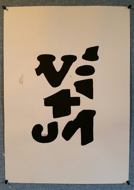
Here are my stencils ready to print over. I hand drew the typographic elements from all three of the fonts and carefully cut out the body with a craft knife, creating the stencil. I pressed over the stencil templates with black printing press paint and a roller, pressing on the paint smooth and accurately.
Baskerville Bold stencil print. Here I extracted and drew the arm and stem of the uppercase 'Z', the leg and arm of the lowercase 'k' that is connected to the left arm of a lower case 'x, the cross stroke and ascender of a lowercase 'f', and finally the tittle of an 'i'.
DIN Alternate stencil print. Here I extracted and drew the spur of the letter 'G', the leg and arm of a uppercase 'K', the tittle of the lowercase letter 'j', and finally the head serif and the shoulder of a lowercase 'r'.
Cooper Std stencil print. Here I extracted and drew two thirds of the cross stroke and head serif of a lowercase 't', the base and serif of a lowercase 'j', two thirds of an uppercase 'W' that includes its apex and serifs, two thirds of the body of an uppercase 'M' that includes the vertex and serifs, finally the tittle and head serif of a lowercase 'i'.
Baskerville Bold stencil print two. Here I extracted and drew the lower stem and serif of an uppercase 'L', the ligature extending as the descender of the letter 'q' I drew the spine of the uppercase 's' split into two, the tittle of a lowercase 'i', and finally the arm and upper half of the stem of an uppercase 'Z'.
All in all, this tutorial was a very relaxed yet, invigorating production workshop. I will take these designs further by illustrating them and merging them into Cinema 4D to explore further dimensions to creativity. I could use techniques I learnt in last weeks C4D tutorial to create interesting artwork, to twist of randomly distort the design into unique outcomes.


No comments:
Post a Comment