Showing posts with label Studio Practice. Show all posts

Thursday, 5 January 2017

Think / Street Billboard Mock ups / Reverspective Posters


 I have placed my reverspective posters in real world billboards to see what the over all outcome looks like in the build environment. I had to use Photoshop skew tools to arrange and lift the reverspective sides, in order to create the pyramid structure extruding from the 2D poster. All in all, it works and I am happy with the unique communication this poster offers. People will pass these posters and will remember the unorthodox nature and will retain the information, whether they like it or not. If people notice it, they will retain the information and fulfilling the job of the poster.

Think / Interactive Applications / Reverspective

Think / Interactive app / Mobile use while driving / Smart phone / Social media / from Charlie Hamnett on Vimeo.

Updated Interactive Application / Digital Poster / Drink Driving / Think from Charlie Hamnett on Vimeo.

A new and rising media channel on social media is the 360 view around an object. This allows the capacity to view the poster from different virtual angles through the screen of a phone. Smart phones have special motion sensors installed into them now and when you twist your phone in any 360 axis to view a special 360 photo, you can view the whole object or scene.

With this in mind, I could inform an idea that can be carried out to communicate the danger awareness posters. I could inform the viewer to tilt the phone in a certain direction and quiz them what they see. After, tilting it in the provided direction, they will not be able to see the road and fulfilling the communication.


Here I have created a communication that can be published into social media. As all smart phones are touch screen, certain applications allow the capacity to scroll around photographs to view a scene from different angles.

This would be a good way to carry out the danger awareness perspective communication. An inverted look theory can be applied and I could tell the viewer to drag the beer pint towards the eye at the bottom of the screen. When the finger scrolls down the screen the perspective of the road will change and the child will disappear. communicating the restricted view a driver would have when under the intoxication of alcohol.


Digital application for mobile phone use while driving, danger awareness. creating a communication that can be published into social media. All smart phones are touch screen, allowing certain applications a capacity to scroll around photographs to view a scene from different angles.

This is a good way to carry out the mobile phone danger awareness perspective communication. An inverted look theory can be applied and I could tell the viewer to drag the smart phone towards the eye at the bottom of the screen. Similar to before, when the finger scrolls down the screen the perspective of the road will change and the child will disappear. communicating the restricted view a driver would have when using their phone and driving.

Final Posters / Digital Format


Digital Poster Creation / Using a phone while driving from Charlie Hamnett on Vimeo.


Digital Poster Creation / Drink Driving Awareness from Charlie Hamnett on Vimeo.

Virtual posters to transfer into digital applications. I have created the reverspective posters digitally in After Effects 3D space. These will serve as a good platform to place into videos and mobile, social media channels for viewers to interact with. Now, I will demonstrate how these posters can be transferred into social media across different media channels. This will be a unique way to target younger generation of drivers, as a platform for them to interact with.


// UPDATED POSTER / DRINK DRIVING

Updated / Digital Poster / Drink Driving / Think One from Charlie Hamnett on Vimeo.

Updated / Digital Poster / Drink Driving / Think from Charlie Hamnett on Vimeo.

Above I have improved the drink driving poster. I have added a transparent reverspective structure over the original design, creating an enhanced double vision effect. As you move around the poster the transparent reverspective will move as you do, but the viewer will be able to see through the structure and notice the still scene of the road beneath. This effect creates an effective communication of how alcohol effects our eyes and the extreme dangers when driving intoxicated. This new effect can work for both physical and digital media channels.

Final Physical Reverspective Poster / Drink Driving


Again, after learning what went right and wrong from my previous poster experimentation, I was able to put my knowledge to the task to create the best reverspective design with the resources I had. Using card and tape that I carefully cut and measured to assemble the design and complete the visual communication.


Updated / Refined / Physical poster / Think from Charlie Hamnett on Vimeo.

Here I have recorded the visual display of the reverspective  alcohol poster design, to give a clearer idea that it works. This poster also moves as you move around it. The intention is to communicate the dangerous restricted view of the driver while intoxicated with alcohol when behind the wheel.

I have again organised a visual hierarchy to guide the viewers eyes.Initially the viewer will notice the poster as a whole, then they will read the message at the top of the poster informing ‘Think! Don't Drink’, with the image of a beer pint. From the position of the beer pint a viewer will not be able to see the whole perspective of the road.

Final Physical Poster Design / Mobile Phone Use


After learning what went right and wrong from my previous poster experimentation, I was able to put my knowledge to the task to create the best reverspective design with the resources I had. I used card tape that I carefully cut and measured to assemble the design. All in all, the design works. When the poster is situated at waist height, as you approach the poster you notice the the child disappear. Due to your point of view situated above the reverspective, when at a certain distance away. At this point the viewer will investigate the poster and will be intrigued by the reverspective effect, noticing the child and the perspective change when looking at the phone in the poster.


Updated / Refined / Physical poster / Think from Charlie Hamnett on Vimeo.

Here I have recorded the visual display of the reverspective design, to give a clearer idea of how it works. As you can see, the poster moves as you move around it. The intention is to communicate the dangerous restricted view of the driver when using their phone while driving. When the viewer is situated above the reverspective display they will be unable to see the whole perspective of the road. This reflects the view of a driver when using their mobile phone.

I have organised a visual hierarchy to guide the viewers eyes. they will initially notice the poster as a whole, then they will read the message guiding them to read the small scale message in the phone. To read this small scale message in the phone they will have to position them self in a place where they can read it. From this position they will notice they cant see the whole perspective of the road.

Friday, 9 December 2016

Reverspective Final Design / Think


Above are my final poster designs ready to print and construct. I am torn between the two above, as to which is the best to represent the reverspective scene of the road. I have a feeling the first image will enhance the reverspective illusion due to the dimming of the lights the further down the road you look. However I will experiment with both to discover the best outcome.

What I have changed from my previous poster before. I have alligned the dashboard more centrally and created a new design to improve the composition. Plus, I increased the scale of the phone and text message at the top of the design, before it was too small and hard to read, even up close. A change of character to improve the communication and create a greater sense of impact upon the audience, with the backstory that comes with him. Finally, I have applied gaussian blurs and filter effects to create the sense of light from withing the city street buildings, this will also enhance the reverspective nature. As the lights get blurrier the further away you look.


These are my reverspective measurements to help me accurately construct the pyramid structure of a reverspective design, resting over the 2D poster print that I use as the base template. I have increased the vertical scale, by x30, of the up and down view aspect of the road scene and increased the horizontal scale, by x30, of the right to left view. This is so the reverspective surfaces are longer than the original and lift to create a pyramid shape that created the perspective illusion.


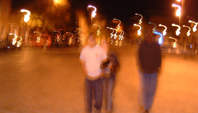
In addition, I have also created another reverspective road scene that communicates the danger of driving under the intoxication of alcohol or drugs. To illustrate this I have used blur, transparency, filter and transform tools to create a distorted scene that is seen through the drivers eyes. This demonstrates the difficulty to drive under the influence of alcohol or drugs, with the vision blurred, double sighted and impossible to pick out which position the child is really stood.

To create the graphics for this alcohol/drug intoxicated scene, I used gaussian blur and applied a lighter colour filter to it to create the impression of a grater beam of light that is blurred and bright, as you would see it when drunk. Plus, I duplicated the reverspective road scene and re-positioned it slightly with a transparent effect to create the sense of double vision. To enhance the drunk/drug scene I used the warp transform tool to create an inconsistent wobbly effect. I used the same process for the dashboard and child, improving the composition and communication as a whole.


Here are the measurements of the drunk/drug reverspective design. Again, I have increased the vertical scale, by x30, of the up and down view aspect of the road scene and increased the horizontal scale, by x30, of the right to left view. This constructs to create the pyramid structure and creates the illusive effect with the perspective in reverse coming out towards the viewer.

Now I need to print these and begin the final stages to the project. Once I have the final reverspectives constructed I will be able to move forward and communicate how this will be carried out across the UK and presented to the public. Also, this print needs to be matt. The previous print in gloss, caught and reflected too much light at times and this inhibited the reverspective nature of the design, by distracting attention off of the reverspective detail.

How Alcohol Effects Vision / Think!

static.independent.co.uk/alcoholeyes.jpg
We all know that drinking alcohol negatively affects our eyesight after drinking a few pints. But, I want to investigate in research how alcohol affects out vision and how people have communicated this through imagery. This will help me create a scene in my reverspective road that correctly expresses the intoxication to out vision, under the consumption of alcohol.

Symptoms

- Blurred vision or even double vision

- Slows the pace of communication between neurotransmitters in the brain, which weakens the eye muscle coordination. This is what causes distorted or double vision.

- Most likely experience some dizziness with blurry vision.

- Loss of vision owing to the direct effect of alcohol on the optic nerve. Whilst it is the eyes that do the ‘looking’, it is the brain that does the ‘seeing’. 

- Decreases the reaction time of your pupils. They are unable to constrict or dilate when reacting to ambient light levels and impairs the ability see contrasting colours or different shades of similar colours.

Representations of Alcohol Inhibited Vision


http://www.thetexasattorney.com/wp-content/themes/enterprise/images/alcohol_affects_driving.jpg
http://www.medicalnewstoday.com/content/images/articles/170/170634/double-vision-fingers.jpg
http://www.rebuildyourvision.com/wp-content/uploads/2014/08/Drinking-Alcohol-Decreases-Night-Vision.jpg
http://www.riskmanagement365.com/wp-content/uploads/2014/11/h-alcohol-drunk-blurry-vision-driving-night.
http://vassil.org/personal/albums/dcbaltimore/DSCF0124br.jpg


I will apply similar techniques to my poster to convey the idea of alcohol and drug intoxication affecting the viewers vision. I could use transparency and blur tools in Photoshop to create this effect, using my existing scene of the road to create a more meaningful message behind the poster.

Tracey Lannon / Tutor Feedback / Think!

In a one to one informal discussion about my work with Tracey Lannon, we discussed interesting concepts that will improve my campaign. Tracey liked my overall idea and offered great pointers to improve the communicative aspect.

Tracey recommended I should include the idea of perspective in terms of how the poster is displayed, working alongside the whole idea of perspective I have with the reverspective illusion. By having the poster lower down around hip or knee height, the scene would not show the child in the poster, until the viewer engages with the design. This will demonstrate the communicative aspect more effectively and create a more powerful reveal of the child who gets hit by the car. The message directing the viewer to read the text on the phone will draw them to the poster and draw them to a position where they will notice the full perspective and be shocked by the appearance of a child. Creating a sense of danger awareness and makes the viewer question their conscience. I will demonstrate below.


Tuesday, 6 December 2016

Think Character / Updated (With Backstory)


In response to feedback from my peer Daniel Boscarino, I have made the amendments to my character to trigger a more emotional connection with the viewer. I have added hair to the character to make him a reasonable age to be crossing the road and not an unsupervised baby stood in the road for no reason, that would have taken the blame away from the driver using their phone and not paying attention to the road. I have illustrated my character holding a football to give a reason for him to cross the road, coming home from the park after playing football with friends. Plus, I have created a full, but short, background story about my character 'Miles' and in this it explains the unfortunate story of his death by the mistreating road user.


Above it the story about 'Miles' and how he was killed by a road user not paying attention to the whereabouts of the environment outside their car. This will create a greater impact on young male drivers to not use their phone while driving, social media can wait, its not worth risking a life.

Peer Review / Daniel Boscarino

My peer Daniel Boscarino gave feedback upon my project that I could respond to in order to improve the communication of my campaign. He recommended that I create a backstory to my character and edit the illustration of the child to give him more personality. This will create a connection with the audience and create a more powerful impact upon the viewer when they discover the child gets hit by an uncontrolled car, resulting in an unfortunate death.


Daniel, liked my overall idea, but he just said it needed to connect that sense of an emotional connection to the character in the design. He said jokingly, when he discovered the child was struck my a car he 'wasn't that bothered' and 'It was the child's fault that he was hit', because he was stood in the road for not reason. Daniel explained that the child needed a reason to accidentally end up on the wrong stick of this of the tragedy. As, the child standing on the road for no reason takes a little of the blame off of the driver reading their message received on their phone, when behind the wheel.


Also, Daniel noted that the child had no hair, meaning they are a baby crossing the road unsupervised and noting 'who would let their baby cross roads on their own'. With this funny remark, it does make sense what he is saying, so I will have to add details to the child illustration to, suggesting his age, reason for being in the wrong place at the wrong time and maybe more. I can express the story of behind this in a short background story of the character.

All in all, Dan's feedback was actually quite constructive towards my project and I definitely feel the background story to the character and adding little details to the character will create a more powerful emotional response to the whole 'Think!' campaign I am creating, when the audience discover the child gets hit by the bad driver of the car.

Reverspective Construction / Experimentation Two / Think!


With this experimentation with +50% horizontal and vertical dimensions, I have again measured the reverspective surfaces, but have also measured the square area that the reverspective rests on. I have measured the square area to keep and use as a stronger connection instead of tape, holding the sides in place to create a stronger pyramid structure.


I also cut out a square area within the card and my printed poster so I could put my hands through and tape together the reverspective sides more accurately. In my first experimentation, it was hard to connect the final side with tape, because there was no way to get around to the other side and stick it together with tape. I had to wedge it together and apply glue to the very edges to create the best result for the final reverspective surface to connect and remain connected to the others.


Once everything was connected, I discovered that the reverspective extruded too far forward and this hindered the perspective range this could be viewed. It restricted the range of view, so you could not see the design from too far right, left, up or down. You had to be situated central and move slightly to get the best effect. Plus, for my final outcome I would have to cover up the white lines of the card edges you can see appearing through the blue of the design, as this hinders the illusive effect. I could do this by simply fixing together the reverspective card structure first and place prints of the came colour of the blue sky and road over the white edges. I can then stick on the reverspective design to compete the effect. This will also help fix together the overall design anyway.


Think! Reverspective Experiment Two from Charlie Hamnett on Vimeo.

To conclude my second experimentation I have produced a video to visually demonstrate the effect. When viewed in video form, this enhanced perspective design seems to work better than the first. I think this design actually works better from a central perspective, however does not allow as much range as the first experimentation with +30% on the horizontal and vertical dimensions. I will discuss this with peers and tutors to gather feedback upon this notion.

Reverspective Construction / Experimentation One / Think


After printing the poster, I purchased quality card and measured the dimensions of the reverspective sides to precisely cut the card to match the dimensions. I did this safely using a cutting mat, Stanley knife and metal ruler to create smooth quality edges to the experimentation.


I then stuck the printed reverspective on to the precisely cut card to create a hard platform to assemble the reverspective within the poster.


Here I have assembled the reverspective card onto my poster, matching the dimensions of the design to build the illusive fitting scene. I have simply used tape on the inside of the reverspective to connect it to the print of the poster. The reverspective lifted high enough to apply tape on the insides to connect each of the sides together, creating an uninterrupted surface on the outer parts of the design.


Finally, I have completed my first reverspective experimentation. The outcome does produce an enhanced perspective and an illusive nature to the design. The message is communicated effectively, with the text directing the viewer to read the message in small scale on the phone and when the viewer sees the design from this perspective they can no longer see the road. I am glad to discover the design works in this communicative manner, I just need to experiment with the design a little more and receive peer and tutor feedback to generate ideas for further improvements to make the necessary amendments and communicate a more powerful message through the poster.


Think! Reverspective Experiment One from Charlie Hamnett on Vimeo.

To conclude my first experimentation I have produced a video of me moving around the reverspective poster, demonstrating the illusive process of the design. As I move up to the top of the design and read the message on the phone, you can see the road disappears and can no longer see the child.

Reverspective Construction & Measurements


Measurements to construct the reverspective. These are the sides to my reverspective that I have measured in photoshop to print and construct physically. The sides have to be longer vertically, for the up and down view angles and longer horizontaly, for the right to left view. By doing this, when fitted into the design the poster will lift to create the reverspective illusion. I did this using the horizontal and vertical transform tools.


Development 2 / Think poster

Moving forward, I have bagan to experiment with composition and content to create the most appropriate and effective design. I wanted to create the impression of a drivers perspective looking through the windscreen, so I was playing around with content that could communicate this aspect. I came up with the idea to include the steering wheel to convey a drivers view and later came up with the idea to illustrate a simple, non distractive, impression of a dashboard. Along side this I needed to communicte a message to guide the viewer to read the text in the phone, plus I need to include my slogan to raise the awarness of the danger of intercting with your phone while driving.


Now, I will move forward with this design as further development to construct physically. I will print the poster to manipulate and construct into a reverspective design. I will measure, cut, connect and lift the poster three dinensionally to create the illusion. I have illustrated the dashboard at the lower parts of the design, reflecting the drivers perspective. The logo is situated at the botton left of the design fitted in to the glove box, to inprove the overall composition. All of the informative information is placed at the top of the design where the phone is situated. This is to guide the viewer to this area of the poster, in order to direct the illusion of the dissapearing road.

Development 2 / Character / Think!

Think Character

I have created a character for my 'Think' campaign to act as the focal point to my communicative message. My character will be situated on the lower reverspective, the road scene and will work alongside the gesture of the mobile phone to complete the reverspective illusive communication.
The phone is situated above the reverspective and will contain a message in small scale to draw the viewer in to read it. When the viewer is up close they will be unable to see the character in the lower reverspective and this will crete an impact and scratch the conscience of the viewer, as they could not see the child while interacting with the phone and the consequence could be horrific in a similar real life situation. This will hopefully make the viewer question their behaviour on the road.

Monday, 5 December 2016

Think Previous Posters / + Poster inspiration


I have gathered previous 'Think!' posters to investigate the composition, content and message. All of the posters have powerful imagery that play with the conscience of the viewer and make them think about their driving, waking drivers up emotionally and physically behind the wheel. The posters use knowledge to warn road users in advance. This message is communicated in a horrifying and stimulating way to challenge people to think about their own behaviour and question themselves. Although, the designs brutally communicate powerful messages, the manner they are carried out is caring. It is caring, because it has your best interests at heart and the aim is to advise, protect and prevent you from danger, keeping you safe.

The composition of the Think posters communicate powerful messages through large images at the centre of the poster, being the focal point to engage the viewer towards the design. Each present the scenario of death or fatal injuries and suggest how it impacts their life and others around. No bright colours are used, a lot of the content is photographed. Think will use photograph footage to create the sense of a real world application, this is something to consider for my outcome. The more digitised outcomes are also used and seem to demonstrate a story that explains a negative impact the incident has had on their lives. Creating the sense of hearing the voice of your conscience, usually through powerful typography or audio narration, in either animations or posters.

Further Inspiration Found Along the Way


As I am intrigued around the idea of illusion and misperception for my 'Think!' campaign, these designs above caught my eye and gave me an idea for a 2D poster. Both posters are composed in a way that made me think of an emerging headlight of a car in a gloomy night, due to the white circumfrance against the dark backgrounds.

I like the idea of the skull illusion on the left, with two ladies dining and conversing and connecting this to the indication of an emerging headlight of a car. To me, it creates the sense of death waking in the presence of an uncontrolled car and communicates the unseen aspect of the two ladies seemingly enjoying their evening. This would be a good way to illustrate a story of how the car approaches uncontrollably towards the women dining in a restaurant, with the scull connecting the sense of death awakening, next to the scene of the ladies and the headlights of the car. Before the car crashes into the restaurant and kills the innocent victims. I imagine the idea to be what you would see in the build up to the 'Final Destination' deaths, almost like you are envisaging a death before it happens.

My idea for the design on the right also communicates a similar story, envisaging a death before it happens. But, in this case the monster in the design can represent the car and communicate the danger of the fearsome vehicle when uncontrolled. In the headlight of the car, shadows of the two children enjoying themselves communicates a different scene, to tell a story as the car approaches. With this idea, it would be necessary to create a background story for the young victims to engage the audience to create a more significant fall to the concluding message in the design.